
Here is the second wave of New Comic book reviews by Alex Knight, feel free to share and talk about or leave a comment too.
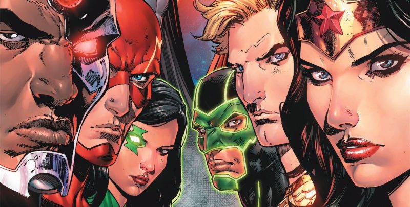
Nightwing #1
After Nightwing Rebirth cleaned the stage for the main event, Nightwing #1 really gets the ball rolling for Dick Grayson. Tim Seeley and Javier Fernandez work in conjunction very well, choosing to play to their strengths.
For writer Tim Seeley, this means creating a narrative similar to the previous Grayson series; double-agenting a shadowy organisation and being forced to partner up with characters he’d rather not. Similarities stop there, as the organisation is by no means friendly, and the bat-family are present. The banter between the Batfamily shows a very subtle piece of progress – Dick Graysons’ time as Agent 37 has evolved him into becoming independent. The stabilisers on his heroic career have been removed. Over 75 years of character development have lead to this point, and it really shows how much faith DC have in this creative team. It should be clear that this decision easily gets my seal of approval.
Javier Fernandez and Chris Sotomayor provide the art and colouring respectively to great aplomb. Clean lines and a palate dedicated to the color blue create flow, establish a light touch whilst keeping Grayson portrayed in a heroic (read: sexy) fashion. It should also be noted that from this issue alone, this art pairing would be very suitable for interior at on a Batgirl book. Their Barbara Gordon is a spitting image of Cameron Stewart’s concept art.
So Nightwing is of to a great start, establishing tone, wit and character progress and also including the controversial issue title: “Better than Batman”. How does it justify such a bold statement? You’ll have to purchase it to find out!
Action Comics #960
In many ways Action Comics #960 seems like an ode to what it meant to create a comic in the 1990s. With Dan Jurgens scripting it is difficult to tell if this is the case.
How so? Some parts are totally unavoidable. Explaining Doomsday’s “I’M MORE HARDCORE THAN HARDCORE” past to other characters (and therefore the audience) is almost embarrassing. There are also points where dialogue becomes a little bit hackneyed but on the whole remains strong, and sometimes the anatomy can be a little wonky.
One page of aside, art work by Tyler Kirkham sees superman fly at Doomsday with absolute gusto, helping to balance the calamity unfolding with the quieter moments of panic. His colouring creates a vibe that echoes Jim Lee and channels work done by fellow DC stalemate Clay Mann. So whilst the narrative has destruction, peril and characters slugging it out; the art helps reading said action becomes a breezy experience.
Jurgens, most commonly known as the writer of the 90s mega event “The Death of Superman” scripts Action Comics #960 with confidence. The story picks up with Doomsday returning to beating the living daylights out of pre-flashpoint Superman. With the sheer carnage occurring in the centre of metropolis, understandably a fellow Justice League member gets involved.
All being said and done, Action Comics #960 has a lot going for it. There is a great resolution to a certain dynamic of which I’m certain will be reassuring for relapsed fans. Art remains solid and encouragingly consistent, and the climax of the issue offers a tantalising glimpse of the resolution for this first arc.
Batgirl Rebirth #1
When Rafael Albuquerque’s exceptionally uncomfortable variant for Batgirl #41 was first revealed, widespread reaction reflected how a character with a resurgence of popularity with a younger target audience could be handled in such a manner. Responding to the uproar Rafael withdrew the cover personally, ensuring physical prints could never come to be. A tactful way of saving face, but it was still surprising to hear his involvement in Batgirl’s Rebirth launch with writer Hope Larson and colourist Dave McCaig.
Controversial context aside, Batgirl Rebirth #1 is light, poppy and comfy ride tailored directly to appeal to newcomers to the series. Barbara Gordon (the titular Batgirl) has moved to Japan, removing her from most friends, family and “…like, eighty per cent of the people who want to kill her.” From this sparks usual tropes, shadowy organisations, mysterious characters with back stories who have yet to be explored.
Hopefully Hope Larson will take Barbara in Japan as an opportunity to flesh out the local historical superhero population, akin to the modern approach The New Super-Man is taking with Chinese. Whilst this remains to be seen, it does show how ripe with opportunity a change in location can be for a Western superhero who (again) hopefully doesn’t seek to force their image upon the native culture and instead learn from it.
Albuquerque’s art has a rough and scrappy feel but sparkles through facial expressions. Colouring from Dave McCaig is primarily toned with bright greens, yellows and blues, throwing in pink for scenes that require extra dramatic flair to great effect. Also worth mentioning is the paneling scheme, especially during the final fight/chase scene. Seamlessly connecting pages together, I had to re-read several pages to appreciate just how badass it is.
Without question this series has me hooked straight off the ‘bat’. It is totally new-reader friendly and would be suitable for pretty much all ages, mild violence aside. I just wish Albuquerque could draw as fast as Larson writes.
Wonder Woman #3
Out of all the series currently on bookshelves to come out of Rebirth, only one had had the sense to simultaneously run storylines on every other book. Why this isn’t the case more often baffles me, but I’m damn well glad it’s the arrangement with Wonder Woman.
Wonder Woman #3 continues the story of how Diana came to be rejected from Olympus. Sadly not much of that particular narrative thread is actually progressed this week. Instead it features a study of the relationship between Wonder Woman and her historical arch enemy, the Cheetah. Greg Ruckus continues to demonstrate that he still has a deft grasp of how that relationship works.
As one might expect from former Spawn alumni, Liam Sharp’s detail and design work is simply top notch. Cheetah seems truly animalistic in her design and the central threat of the issue appears how one might expect from a wonder woman comic-excessively masculine. With Laura Martin on colours this arc features a mature and much darker colour scheme in contrast to the even weeks, emphasising the maturity present within her modern incarnation.
Wonder Woman is absolutely a can’t-miss book, and although this issue was light on plot, it was dense in art and character development. Totally worth checking out.
By Alex Knight
You can also follow Alex on Twitter @apknightable
